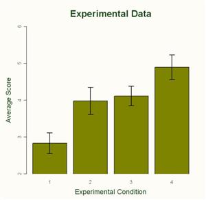
 I got this graph today. I’m not going to go into what it means right now. Suffice it to say that it’s real data from my experiments. It’s preliminary analysis, but I think there’s something there.
I started working on this study ages ago. It’s been months of planning and pilot testing and running subjects and data crunching to get to this point. Months of not knowing whether or not there was anything to see. Was I barking up the wrong tree? Does my argument make any sense? Am I even measuring what I think I’m measuring?
But today I typed a few commands into my trusty R Console, and saw those magic asterisks that said that my model was significant. Kind of anti-climactic, in a way. But still way better than not seeing the magic asterisks.
Of course, I’m not done yet. I still have to run all kinds of error checking and double-check my work. And I have to go over all of the lab procedures to make sure that everything worked the way it was intended. And then there’s that little step of writing it all up. But today I have a graph that I can explain using my theory. Yeah!